Quoting a transfer without knowing the price
A Ria agent stands at a counter with a customer in front of them and quotes a money transfer. In the portal they used, every number on the screen read 0.00 until the order was saved, and the promo code field was greyed out. I redesigned the shift home and the two order steps so the rate, the fee and any active promotion are on screen from the first keystroke.
Designer on the quoting flow
I designed the FX quoting flow, ran the audit, made the interaction calls, built the prototype, alongside the platform team and the agent support desk. Those two channels and the portal itself were my whole picture of how agents quote. I never stood at a counter, which matters and I'll come back to it.
The fee-visibility work shipped. The shift home and the recipient screens didn't; they're a concept built on top of what did, and they're labeled that way everywhere they appear.
Every number said 0.00
Ria agents are shop staff. A corner store, a travel agency, a check casher: someone is behind the counter with a queue, and the customer wants one thing answered before they hand over cash. How much does it cost to send two hundred dollars to Manila.
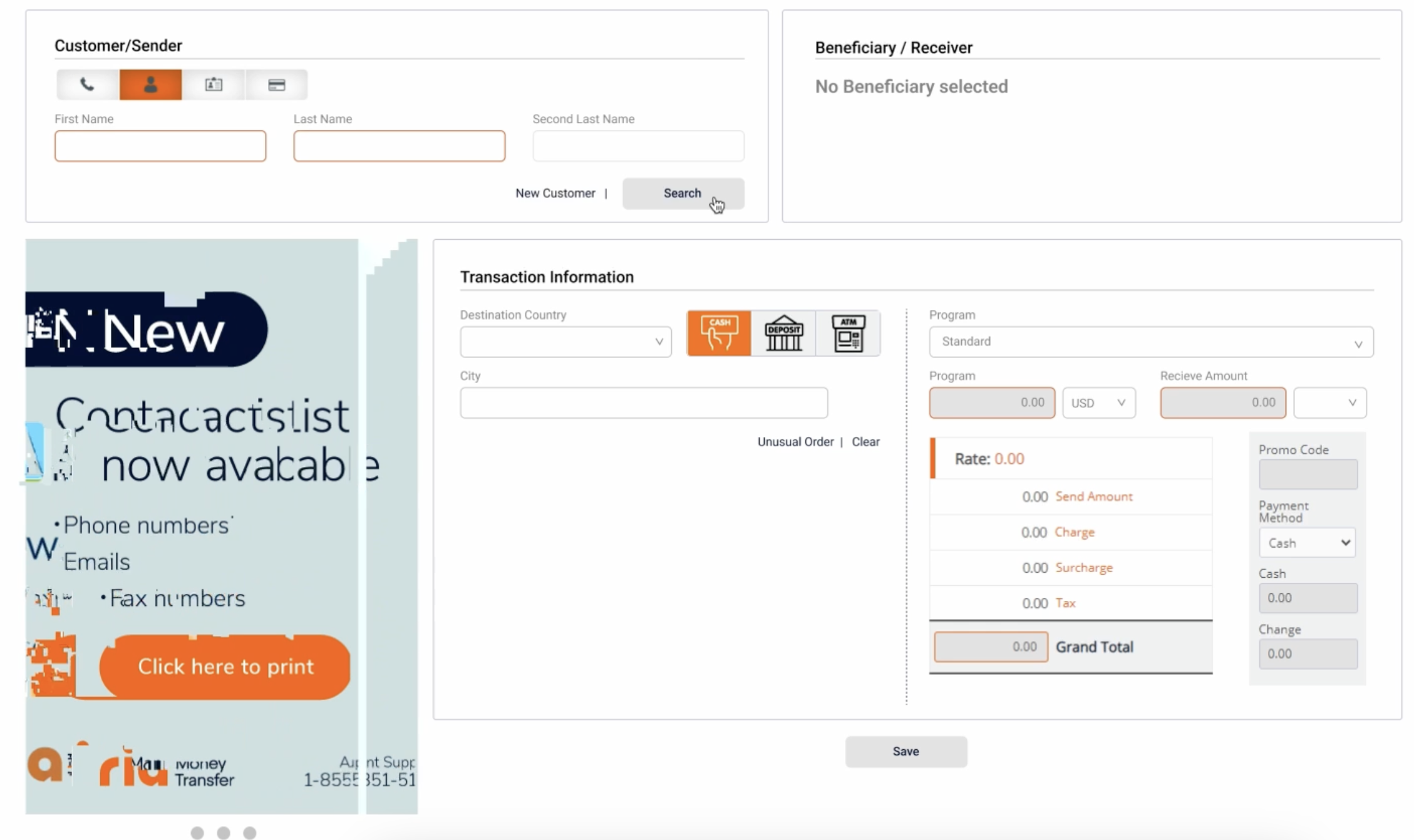
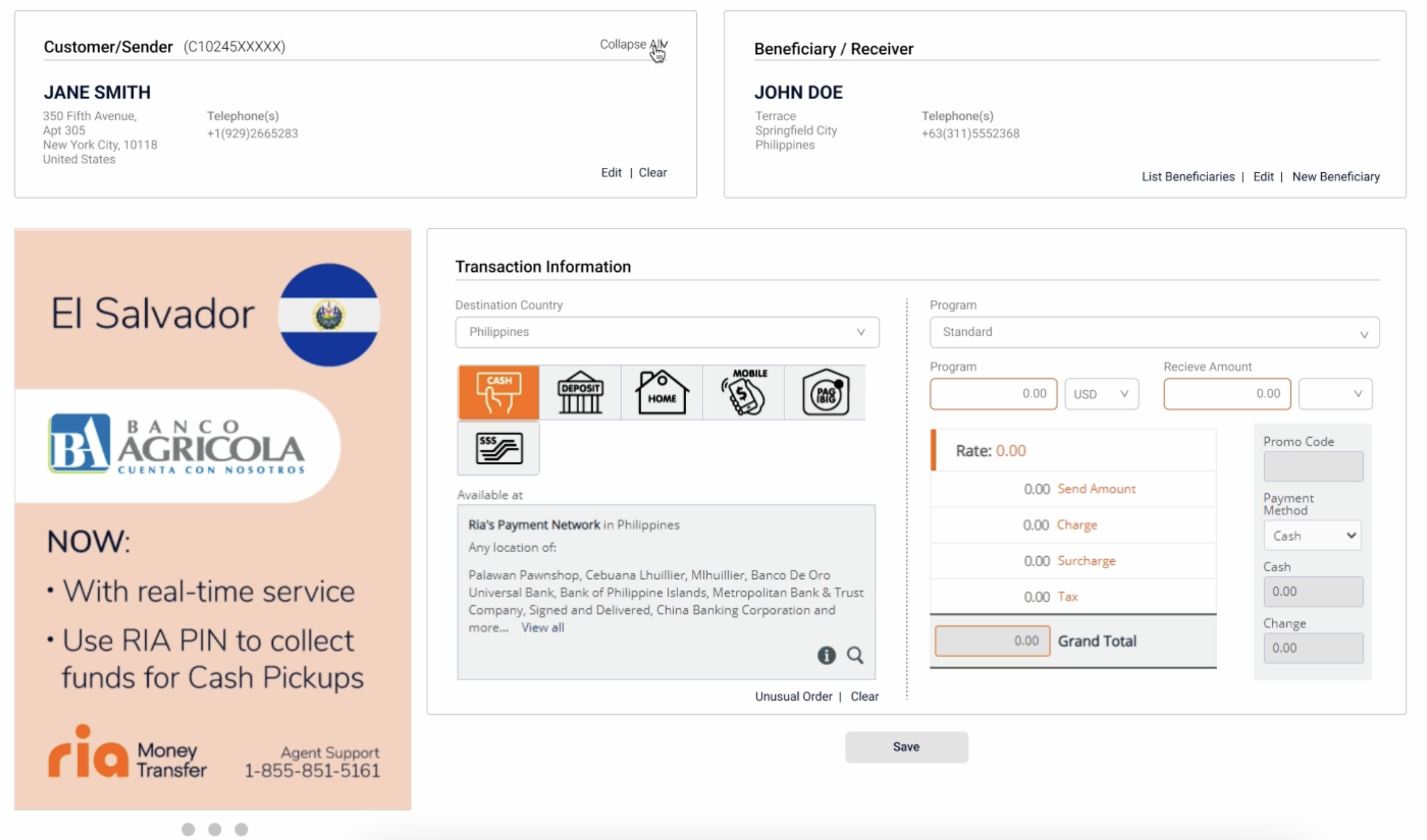
The portal could not answer that question until the transaction was already written. Rate, send amount, charge, surcharge, tax and grand total all sat on the screen reading 0.00 while the agent typed.
- The fee panel populated on save. Agents quoted from memory, a printed rate sheet, or a phone call to agent support.
- Sender identity and beneficiary were two separate searches before the transaction form unlocked, so a repeat customer still took four steps.
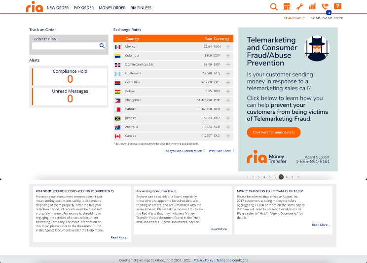
- The shift home gave its best real estate to a ten-slide promotional carousel. Compliance holds and unread messages, the two things that actually stop a shift, were a pair of small counters showing 0.
- Delivery method was a row of unlabelled icons. Cash, deposit, home delivery, mobile wallet and two Philippines-specific options were told apart by pictogram alone.
- Exchange rates lived in a separate table with a Print Rate Sheet link, which is how the paper on the counter got there.
The portal as agents used it
Answer the counter question first
I did not touch the transaction model. Compliance rules, payout networks, program types and the fields the wire actually needs all stay exactly as they were, because none of them were the problem. What changed is the order the portal asks in, and what it is willing to tell you before you commit.
Ria's own consumer app already sets the standard here: it shows the fee and the rate before the customer confirms. An agent portal that withholds the same numbers from the person doing the quoting is breaking a promise the brand has already made.
What changed, line by line
The redesign is deliberately unglamorous. Most of it is moving a number earlier, giving an icon a label, or letting a field be filled in by something the system already knows.
| Moment | Before | After |
|---|---|---|
| Quoting a price | Rate, charge, surcharge, tax and total read 0.00 until save | All five recalculate as the amount is typed, in a panel the agent can read across the counter |
| Promotions | Promo code field greyed out; agents did not know a promotion was running | Qualifying promotions apply automatically and are named in the quote, with the saving shown |
| Repeat customer | Sender search, then beneficiary search, then the transaction form unlocks | Sender lookup surfaces saved recipients as cards; picking one fills the transfer |
| Delivery method | A row of unlabelled pictograms, up to six per country | Labelled options with payout partner and speed, grouped by what the country supports |
| Starting a shift | Two counters reading 0, a rate table, and a ten-slide advertisement | Holds and messages as readable states, today's rates in place, one dismissible notice |
| Language | English interface; Spanish-speaking staff worked from a printed sheet | An English and Spanish toggle in the header that persists across the shift |
Three screens, clickable
The redesign was built as a working front end rather than a flat comp, so the agent support desk could argue with the real thing in a review. Tabs, delivery methods, amount fields, saved recipients and the language toggle all work. Designed at 1280px and up, which is what an agent terminal actually is.